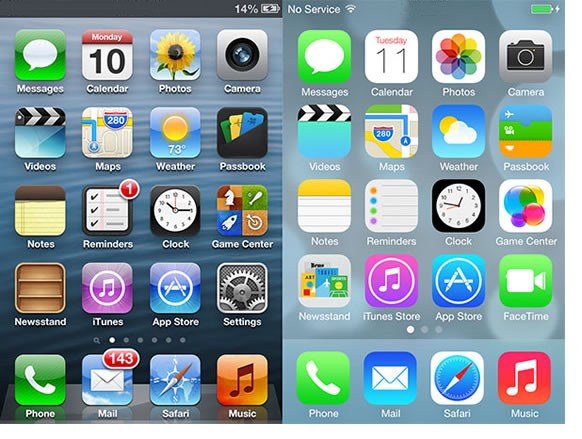
The difference between skeuomorphism and neuomorphism
Skeuomorphism is a design style that mimics the appearance of real-world objects in digital interfaces. For example, a skeuomorphic calculator app might look like a physical calculator with buttons and a screen. Skeuomorphism aims to make users feel familiar and comfortable with the interface by using recognizable cues from the physical world.
Neuomorphism, on the other hand, is a design style that creates the illusion of depth and dimensionality in digital interfaces. For example, a neuomorphic button might look like it is raised from the background with shadows and highlights. Neuomorphism aims to make users feel immersed and engaged with the interface by using realistic lighting and textures.
Neuomorphism is a design style that combines elements of skeuomorphism and flat design. Flat design is a minimalist style that uses simple shapes, colors, and typography, without any shadows or textures. Neuomorphism creates a soft and subtle 3D effect by using light and dark shades of the same colour. For example, a neuomorphic UI might use buttons that look like they are slightly raised or indented on the background.
The main difference between skeuomorphism and neuomorphism is the level of realism and detail. Skeuomorphism tries to replicate the real world as much as possible, while neuomorphism simplifies and abstracts it. Skeuomorphism creates a familiar and nostalgic feeling, while neuomorphism creates a futuristic and elegant feeling.
Both skeuomorphism and neuomorphism have their advantages and disadvantages. Skeuomorphism can make UI more intuitive and engaging, but it can also make it cluttered and outdated. Neuomorphism can make UI more sleek and modern, but it can also make it less accessible and contrastive.
The choice of design style depends on the purpose and context of the product. Some products might benefit from using skeuomorphism to convey a sense of authenticity and quality. Others might prefer using neuomorphism to create a smooth and sophisticated look. Some products might even use a combination of both styles to achieve a balance between realism and simplicity.
These styles go beyond interfaces, and can be used in graphic design.
So, which one do you prefer? Let me know in the comments below! And don't forget to subscribe to my blog for more design tips and tricks. Thanks for reading!


