
How to use typography to enhance your message and aesthetic
Why is typography important? Well, typography can help you communicate your message more effectively and create a visual identity for your brand or project. Typography can also influence the mood, tone, and emotion of your readers. For example, a bold and heavy font can convey strength and confidence, while a light and elegant font can convey elegance and sophistication. Typography can also help you create contrast, hierarchy, and harmony in your design.
Typography can also be used to convey meaning and emotion, to create a visual identity, and to enhance the overall design of a document or a website. In this blog post, we will explore some of the basic principles and tips on how to use typography to enhance your message and aesthetic.
The first thing to consider when choosing a typeface is the purpose and context of your text. Different typefaces have different personalities, associations, and histories that can affect how your readers perceive your message. For example, serif fonts, such as Times New Roman or Georgia, are often considered more formal, traditional, and authoritative, while sans serif fonts, such as Arial or Helvetica, are more modern, clean, and neutral.
Script fonts, such as Brush Script or Zapfino, are more decorative, elegant, and expressive, but they can also be harder to read at small sizes or in large blocks of text. You should choose a typeface that matches the tone and mood of your content, as well as the expectations and preferences of your audience.
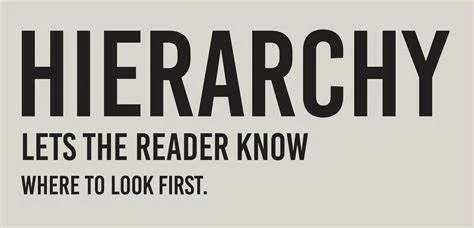
Another thing to consider is the hierarchy and structure of your text. Hierarchy is the way of organizing and prioritizing information according to its importance and relevance. You can use typography to create hierarchy by varying the size, weight, colour, alignment, and spacing of your text elements. For example, you can use a larger and bolder font for your headlines and subheadings, a smaller and lighter font for your body text and captions, and a different colour or style for your links and keywords.
You can also use alignment and spacing to create contrast and balance between your text elements. For example, you can use left-aligned text for a more formal and organized look, center-aligned text for a more symmetrical and harmonious look, or right-aligned text for a more dynamic and unconventional look. You can also use more space between your lines (leading) and between your letters (kerning) to improve the readability and legibility of your text.
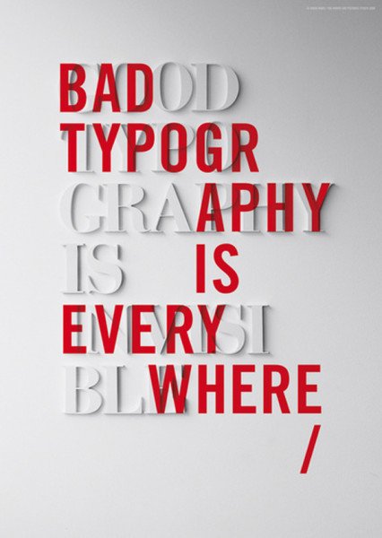
Finally, you should consider the aesthetics and creativity of your typography. Typography is not only a functional tool but also a visual element that can enhance the overall design of your document or website. You can use typography to create interest, harmony, contrast, or tension in your layout.
You can also use typography to express your personality, style, or brand identity. For example, you can use a custom or handwritten font for a more personal and unique touch, or you can use a geometric or futuristic font for a more modern and innovative touch.

You can also combine different fonts to create contrast or harmony between them. However, you should be careful not to use too many fonts or too many styles in one document or website, as this can make your typography look cluttered and confusing.
Typography is a powerful tool that can help you communicate your message effectively and beautifully. By following some of the basic principles and tips we discussed in this blog post, you can use typography to enhance your message and aesthetic.