
Knowledge transfer for emergency healthcare in Alberta infographic
Layout
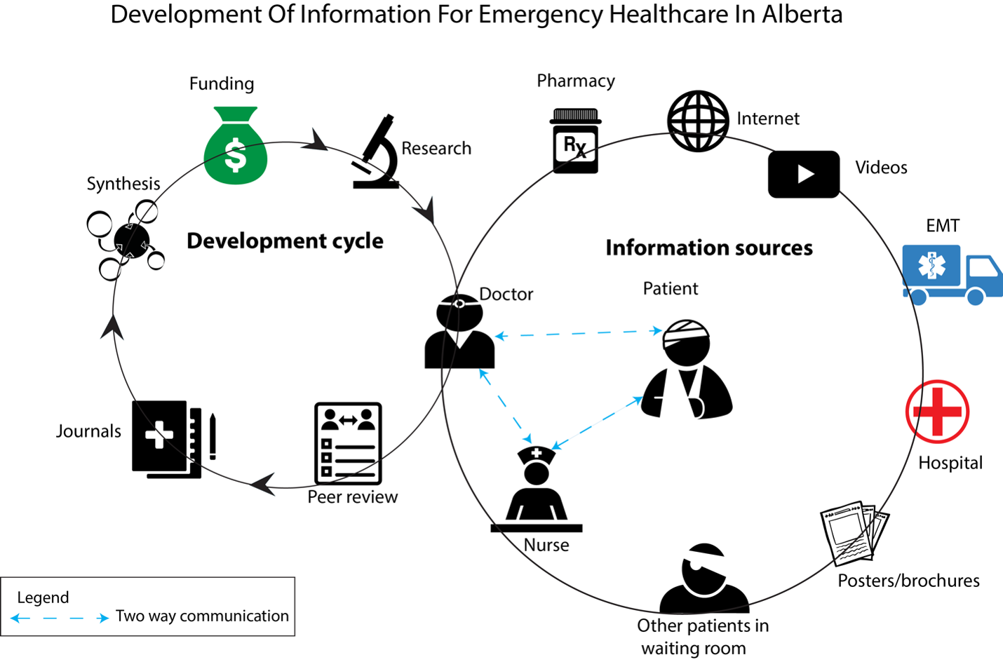
The graphic starts at top left as this is how we read. Based on research, the first thought for layout was to do a hierarchical based design. The position of the doctor icon is overlapping both the information development cycle and communication circle because the doctor is the central figure of acquiring knowledge and then transferring it to the patient.
Process
These are sketches of the ideas I had. I’ll only put a couple in, these are bad :(


Colours
For my colour palette that I went with is Alberta Health services blue and green. Doing this signifies that the graphic is related to healthcare. Blue is used to represent development; green represents communication. The start bubble is blue to draw the viewer visually to start at the information development cycle.

Iterations
Form
During the research process, I was originally thinking of doing a hierarchical graphic based on the top down nature of the research. This approach didn’t work as well as I thought it would when in digital form. It then changed into a flowchart type of approach, but it wasn’t aesthetically pleasing or interesting. It took on it’s current form of a cycle for the information development cycle on half the graphic as this process requires less steps when compared to communication.
Getting close…

Typography
The font I chose was Arial Black for the labels and headline to make it stand out and easier to read the graphic from a distance. The font for “Start” is Azo Sans Uber Regular to differentiate it from the rest of the graphic to make it easier to know where to start.
